Overhead Door Company
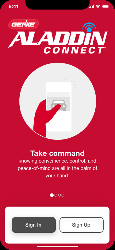
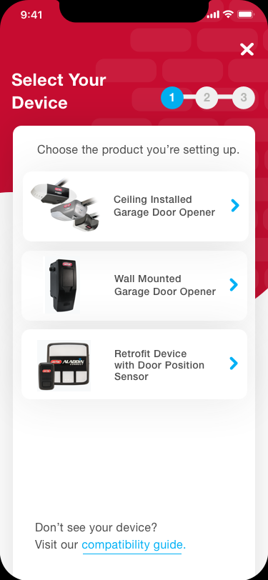
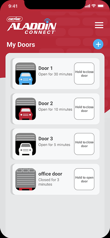
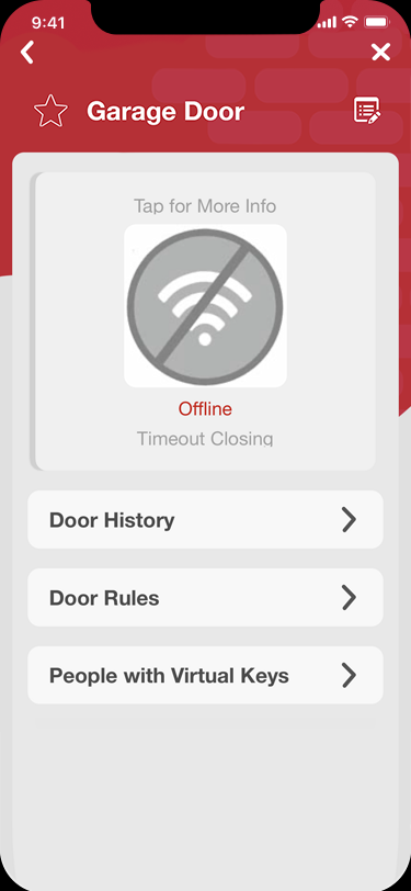
I recently worked as a UX Design Intern at Overhead Door Company. It was an amazing oportunity to take what I have learned and apply it to real life situations. There were three other interns and myself tasked with working on the Genie Aladdin Connect remote garage door mobile app. My role was to add in new features for an upcoming version of the mobile app.
The Problem
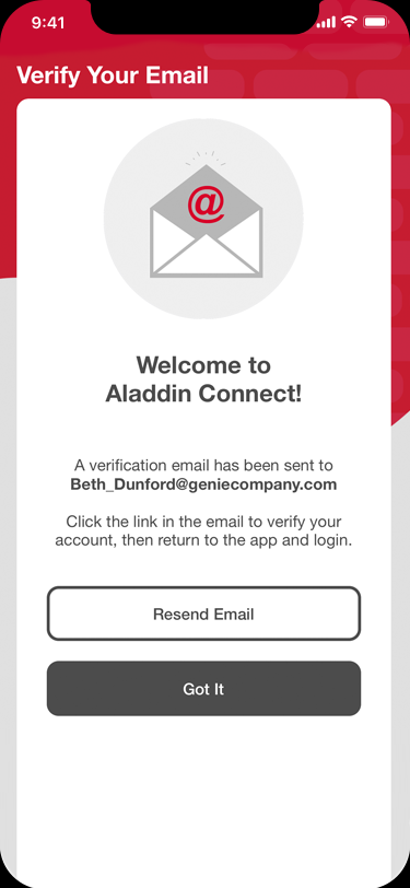
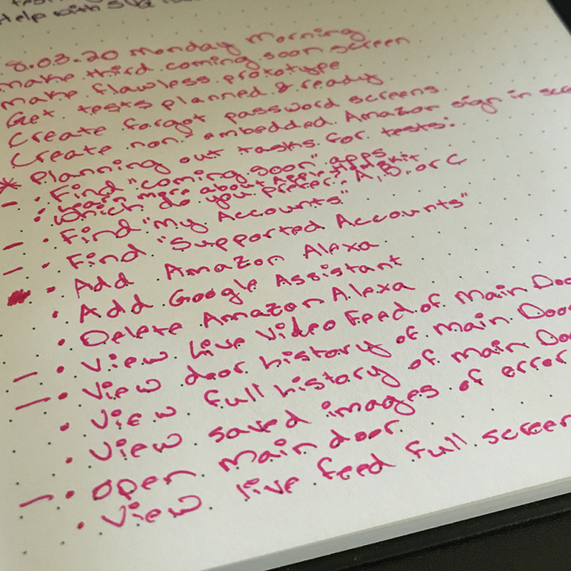
As I was tasked with adding new features seamlessly into an already existing app, I had to think of the informational architecture and figure out the best spot to place these features. There were three new features total: third party app integration, video integration, and dealer/store information.
The Process
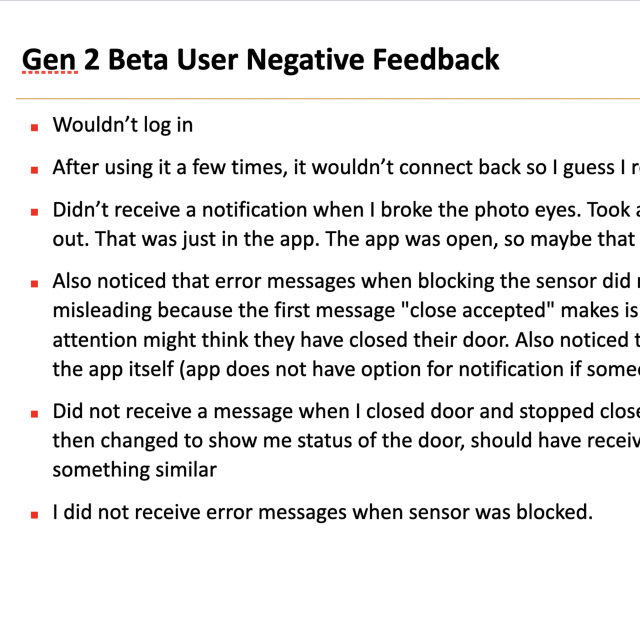
I poured over test results from a previous version of the app to get a feel for what the users liked and didn't like. I spoke with my manager at length to get a feel for what the company wanted from these features. It was important for me to have a firm grasp of what both parties wanted so I could ideate & create a solution that would be fitting for both. I sketched, designed lo-fi wireframes, spoke with the other three interns to gain their insight and talked with the developers to get their input as well.
The Solution
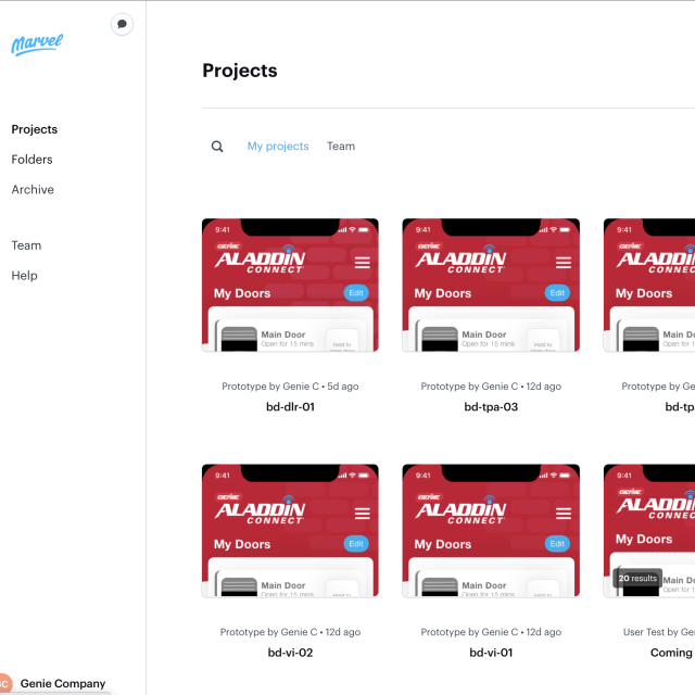
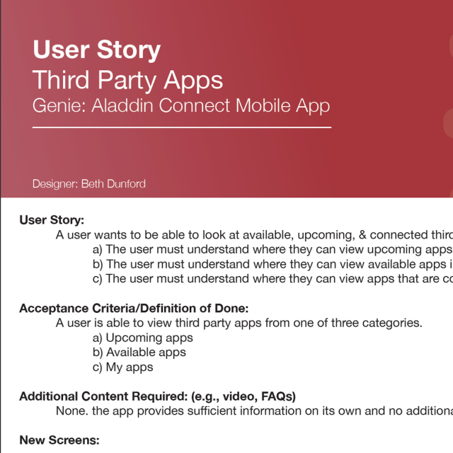
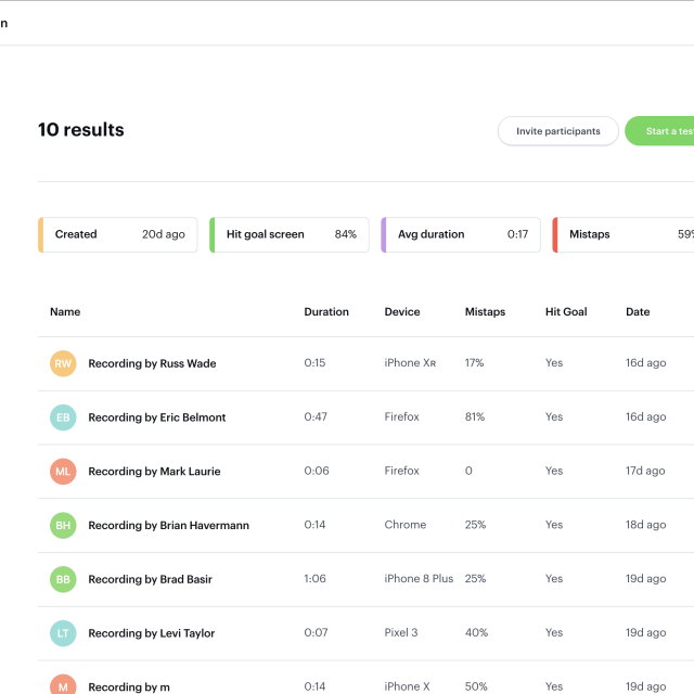
I decided to break each new feature down to make it more palatable for the users, since they're not the most tech savvy. The third party app integration was broken down into three key pieces: where the user could view upcoming third party apps and learn more about them, where the user could view third party apps that are available in their region, and where the user could view the third party apps that they already had connected with their Genie Aladdin Connect app. I built out hi-fi wireframes of each of these sections and prototyped them in Marvel. Once that was done, I sent them out for user testing. The lowest success rates of these tests was 11% and the highest was 95%. The Marvel testing allowed for screen, audio, and video recording. I listened to all the feedback and took copious notes. I watched the screen captures that had no audio or video recordings. Through this insightful feedback I realized some of my success rate failures were just in how large I made the clickable area. The low success rate prototypes were overhauled. Even the UX writing needed work. After gathering all the info I could from the user testing, I rewrote, redesigned, and re-prototyped. At that point I created a document for the development team so they could follow my thought process even though I would no longer be there. I aimed to be as clear and thorough with this document as possible.
The video integration was also broken down into three key pieces: the user could view the video feed from door detail screen, the door history screen, and from an open or close error pop-up. The success rates in user testing on this feature were much more positive, with the lowest being 78% success and the highest being 84%. I took this feedback and integrated minor tweaks before creating the handoff document for the developers.
The dealer/store information feature only had one week for work to get completed, so there was no user testing, only ideation and hi-fi wireframes and prototypes. This feature was broken down into five key pieces: where the user could view their favorited stores & dealers, where the user could find nearby stores, where the user could find nearby dealers, where the user could view ratings of particular dealers, and where the user could view the legend describing what the icons mean. I again created a thorough document for handoff to the development team.
The Prototypes
This prototype shows the flow of viewing upcoming third party apps and learning more about them.
This prototype shows the flow of viewing available apps in the users' region.
This prototype shows the flow of viewing the users' connected apps.
This prototype shows the flow of viewing the video feed from the door detail screen.
This prototype shows the flow of viewing the video feed from the door history screen.
This prototype shows the flow of viewing the video feed from an error screen.
This prototype shows the flow of viewing the users' favorited stores and dealers.
This prototype shows the flow of finding nearby stores.
This prototype shows the flow of finding nearby dealers.
This prototype shows the flow of one method of finding dealer ratings.
This prototype shows the flow of a second method of finding dealer ratings.
This prototype shows the flow of one method of finding the dealer legend.
This prototype shows the flow of a second method of finding the dealer legend.
The Handoff
These are the three documents I created for handoff to the development team. My goal was to be as clear and concise as possible as I knew I would no longer be at the company by the time the developers implemented these new features. I included the user story, a definition of being complete, the new screens I designed, the clickable area of each screen, the flow from one screen to the next, and short video of the prototype of that particular flow. Comprehensive information to help the next team handling my work is always a goal of mine.
The Results
Since my internship was a short six weeks, the developers have not implemented the new features I designed yet, nor was there time to do follow-up user testing. However, my manager was very pleased with everything I presented and was very hopeful to continue working with me in the future. The developers were relieved at the quality and thoroughness of the files I delivered to them, which included the user story document, the prototype videos, the working Sketch files, properly saved SVG files for Android Studio and PDFs at 1x and 2x for Apple. I'm very thankful for the time I was able to spend at Overhead Door Company, as it was an incredible learning experience.