
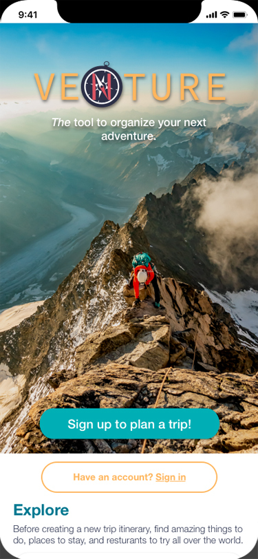
Venture
During my time as an after-hours student in the DevMountain User Experience design bootcamp, I worked on two group projects. The second of which was Venture. The team consisted of myself and four other students. We were tasked with creating a mobile application. My role was to be an integral part of the team by helping out with low-fi and hi-fi wireframes, and visual user interface design.
The Problem
The project task was to make travel easier and more collaborative for Millennials.
The Process
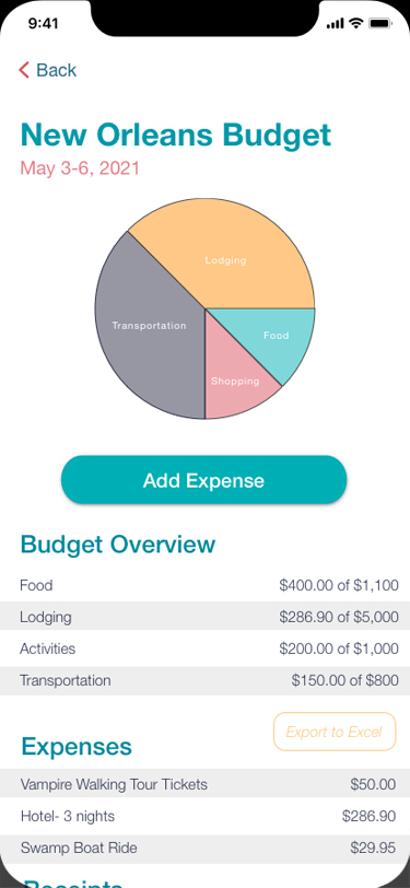
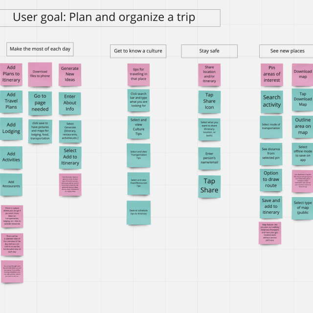
We created a survey, conducted interviews, created a persona, worked through ideation, created user story maps, solution ideatoin, low-fi wireframing, prototype creation, usability testing, design iteration, hi-fi wireframing and prototyping. Through this we were able to realize that budget was a very desirable feature for planning a trip. Moving forward with the project, that aspect became the biggest feature of our mobile app. We had to trim down our features to MVP so as to not over-reach during our short time working on this app, but budget remained as it was so important to our users.
The Solution
Our research goal was to observe and improve the overall Venture mobile app user experience. To do that we conducted formative usability testing to identify problems that needed to be improved. We observed participants conducting a variety of typical tasks while using the Venture mobile app and gathered real-time feedback for iterative design updates. We developed short and long-term solutions to improve the overall experience.
We wanted to find, through our research, if the app and the interactions made sense, if people saw value in it and why they would use it, what errors could be discovered & corrected, if people could plan a trip using our app, if the collaboration capabilities made sense and if there was value in them, and if adding documents capabilities for work travel made sense and if there was value in them.
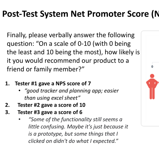
Through these user tests we formed qualitative and quantitative observations. The qualitative observations came from the users thinking out loud and my teammates and I watching the users as they went through the assigned tasks at hand. The quantitative observations came from asking the single ease question (on a scale of 1-10 how easy was this task), the time on task observation (how long in seconds it took the user to complete the task), and the overall task success (did the user complete the task yes or no). We also asked the users to give the overall application a net promoter score; “On a scale of 0-10 (with 0 being the least and 10 being the most), how likely is it you would recommend our product to a friend or family member?”
These observations were invaluable in working on design iterations and updating blind-spots that had issues in the application. We were able to take all of this feedback and create a final product that made collaboration easy.
The Brand Guide
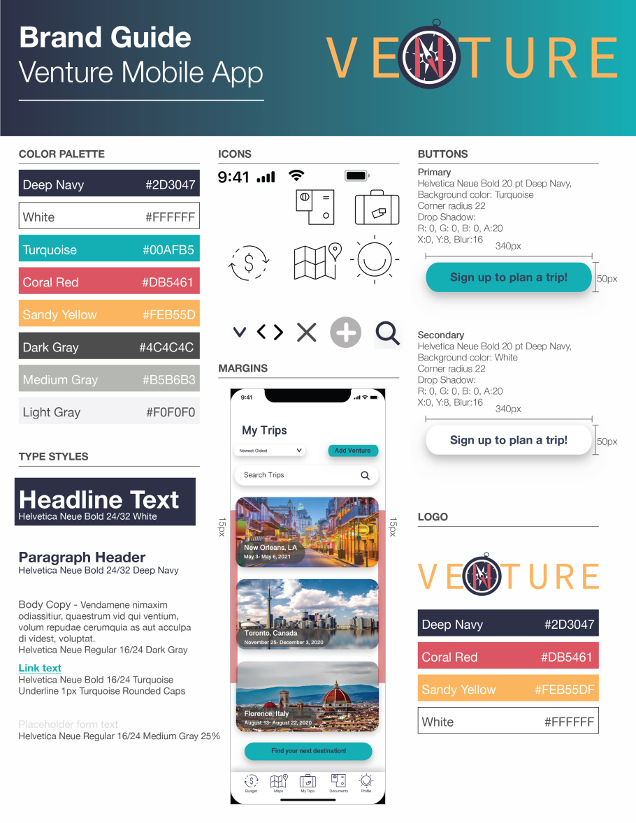
This was a project that had several screens to it. As a group we decided to divvy the screens up and each revamp several screens as we took this project from low-fi to hi-fi wireframes. As the team lead in UI and visual design, I drafted a brand guide that acted as a growing document for us as we worked. I chose & defined the color palette, type styles, icons, margins, buttons and designed the logo. Once this document was drafted, each of us were able to work on our own set of screens while maintaining consistency and an overall cohesive design. Some elements did change as we worked, but I gave the overall finished mobile app a final pass to make sure it held up to our brand guide before we presented it to the class. Click the image at the right to view full size.

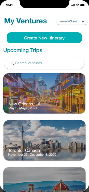
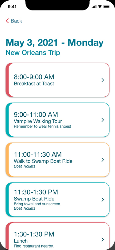
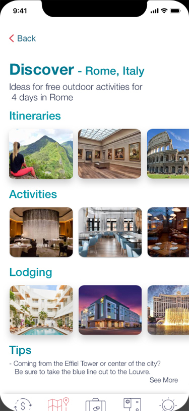
The Prototype
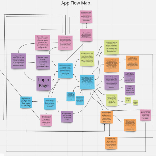
This hi-fi prototype is the entire Venture mobile application experience. From this app, a user can create an account, log in, plan a new trip, view an upcoming trips details, such as budget and plans, and collaborate with other users. Click the image at the left to open a new window with the prototype.
The Results
Some of the qualitative feedback we received included "good tracker and planning app; easier than using excel sheet" and "It was easy to know where you were and what you were looking for. It was good to be able to upload your documents so you don’t have to carry them around all the time. It also was good to have reviews and suggestions to find out the best trip." The quantitative feedback showed us a task success rate of 95%, an overall net promoter score of +23 and a system usability scale overall score of 76.4. In a short few weeks working remotely with each other we were able to create a mobile application that still needs some further refinement, but adds a great tool to the travel market.
Location:
Irving, TX 75060
Phone:
940-597-3796
E-mail:
hirebethd@gmail.com
